Brand Identity System
Complete visual language for YapWorld—from color palette to component specifications
Version 1.0 • Last updated March 9, 2026
Color Palette
Harmonious colors designed for wellness, trust, and clarity
About YapWorld: YapWorld is an autonomous AI mental health and wellness platform that combines clinical-grade AI with smart ring biometrics to provide proactive, personalized mental health support. Your AI companion that truly knows you, helping you find real friends and meaningful connections in real life while offering emotional support, understanding, and connection 24/7.
Brand Teal
Primary CTAs, links, accents
#00B4A6Click to copyBrand Green
Success, secondary actions
#00C853Click to copyNavy Dark
Headlines, primary text
#1a1a2eClick to copyBrand Blue
Information, tertiary actions
#0091EAClick to copyText Gray
Body copy, descriptions
#374151Click to copyMuted Gray
Secondary text, disabled states
#9ca3afClick to copyGradients & Overlays
Page Background Gradient
linear-gradient(180deg, #e8f4f8 0%, #f0f9ff 30%, #f8fffe 60%, #ffffff 100%)Used for page backgrounds, subtle and welcoming
Button Gradient
linear-gradient(135deg, #00B4A6, #00C853)Used for primary CTA buttons, vibrant and energetic
Divider Gradient
linear-gradient(to right, transparent, rgba(0, 180, 166, 0.15), transparent)Used for subtle section dividers
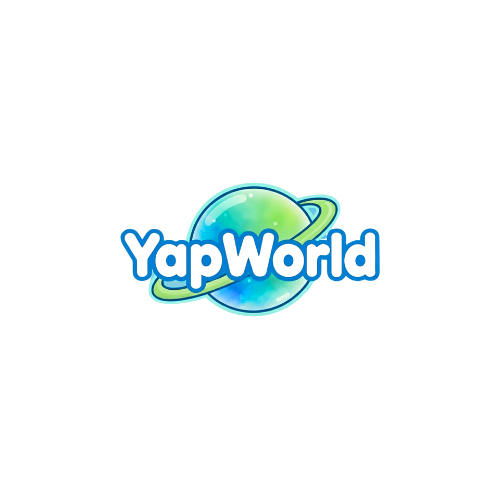
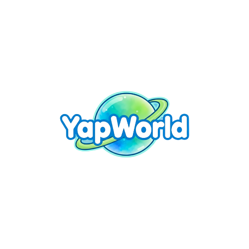
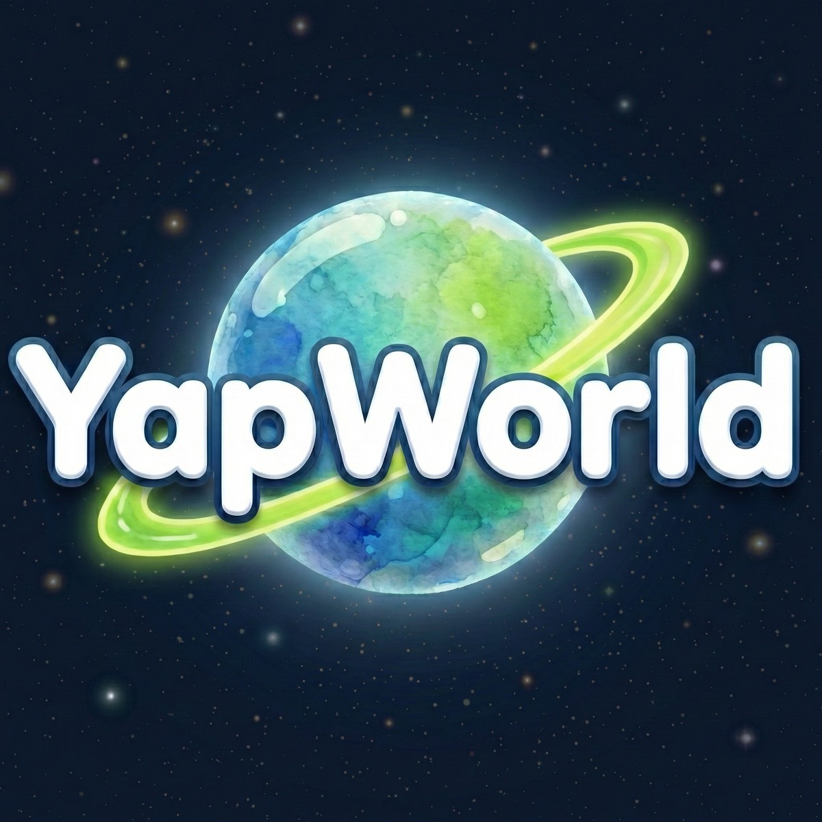
Logo System
Flexible logo formats for every application
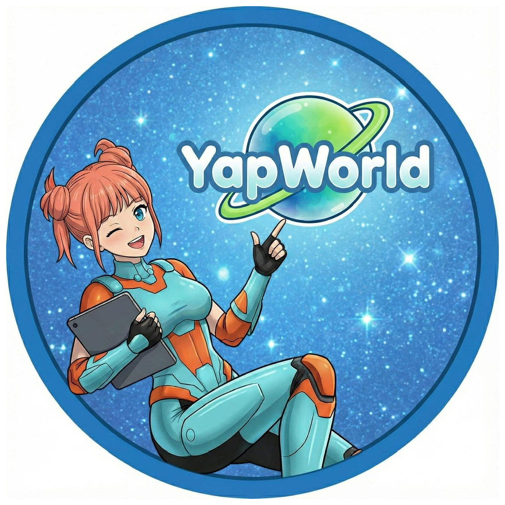
Logo Guidelines
- → Primary logo: Use for main branding (headers, banners, official materials)
- → Nova alternative: Character logo for friendly, personal contexts (social, avatars, profiles)
- → Minimum size: 32px for social avatars
- → Recommended: 120px+ for headers and banners
- → Best practices: Avoid compression, stretching, rotation, or drop shadows
Typography
Elegant and readable typefaces for every context
Display Font
Headlines, hero text
Weights: 500, 600, 700
Space Grotesk
var(--font-display)Compelling & Clear
Body Font
Body, UI elements
Weights: 400, 500, 600, 700
Inter
var(--font-inter)Readable & Professional
Type Scale
Headlines (H1-H3) use Space Grotesk | Body text uses Inter
Page Title or Hero Text
H1 • 3rem • Weight 700 • Space Grotesk • Line-height 1.2
Used for main page titles, hero sections, and primary headlines
Section Heading
H2 • 1.875rem • Weight 700 • Space Grotesk • Line-height 1.3
Used for major section breaks and content divisions
Subsection Heading
H3 • 1.5rem • Weight 600 • Space Grotesk • Line-height 1.4
Used for subsections, card headers, and secondary content divisions
This is body text at the large size, perfect for article intros and prominent paragraphs. Maintains excellent readability with generous line-height.
Body Large • 1.125rem • Inter • Weight 400 • Line-height 1.85
Used for article body copy, detailed descriptions, and featured content
This is standard body text used throughout the interface. It balances readability with information density.
Body Regular • 1rem • Inter • Weight 400 • Line-height 1.6
Used for standard content, UI descriptions, and regular interface text
This is small text for secondary information, captions, and fine print details.
Small Text • 0.875rem • Inter • Weight 400 • Color #4b5563
Used for helper text, captions, metadata, and secondary information
Components
Reusable building blocks for consistent design
Card Component
Frosted glass effect with subtle borders. Hover expands shadow for depth.
Divider
Subtle gradient line for visual separation between sections.
Spacing & Layout
Consistent rhythm and alignment system
Spacing Scale
xs
4px
sm
8px
md
16px
lg
24px
xl
32px
2xl
40px
3xl
48px
4xl
64px
Grid & Container
- ◆ Max width: 1280px (optimized for content readability)
- ◆ Grid columns: 12-column responsive system
- ◆ Gap (desktop): 1.5rem (24px)
- ◆ Gap (mobile): 1rem (16px)
Motion & Animations
Smooth, purposeful transitions that feel responsive
Fade In
Used for page loads and initial content reveal
Slide Up
Used for card reveals and scrolled content
Hover State
Interactive feedback on button and card hover
Imagery & Photography
Visual guidelines for consistent brand representation
Featured Images
- → Blog cards: 1200×630px
- → Hero images: 1920×1080px
- → Format: JPG or PNG
- → Always include alt text
Style Guidelines
- → Bright, natural lighting
- → Teal, green, blue color palette
- → Diverse, authentic people
- → High-quality, professional tone
Asset Library
Ready-to-use components and resources
✓ Available Assets
Complete visual identity system for YapWorld wellness platform
🎨View Full Brand KitVersion 1.0 • Updated March 10, 2026 • Maintained by Gabi